Thanks to the judges' favor, this work won the 2025 iF design award
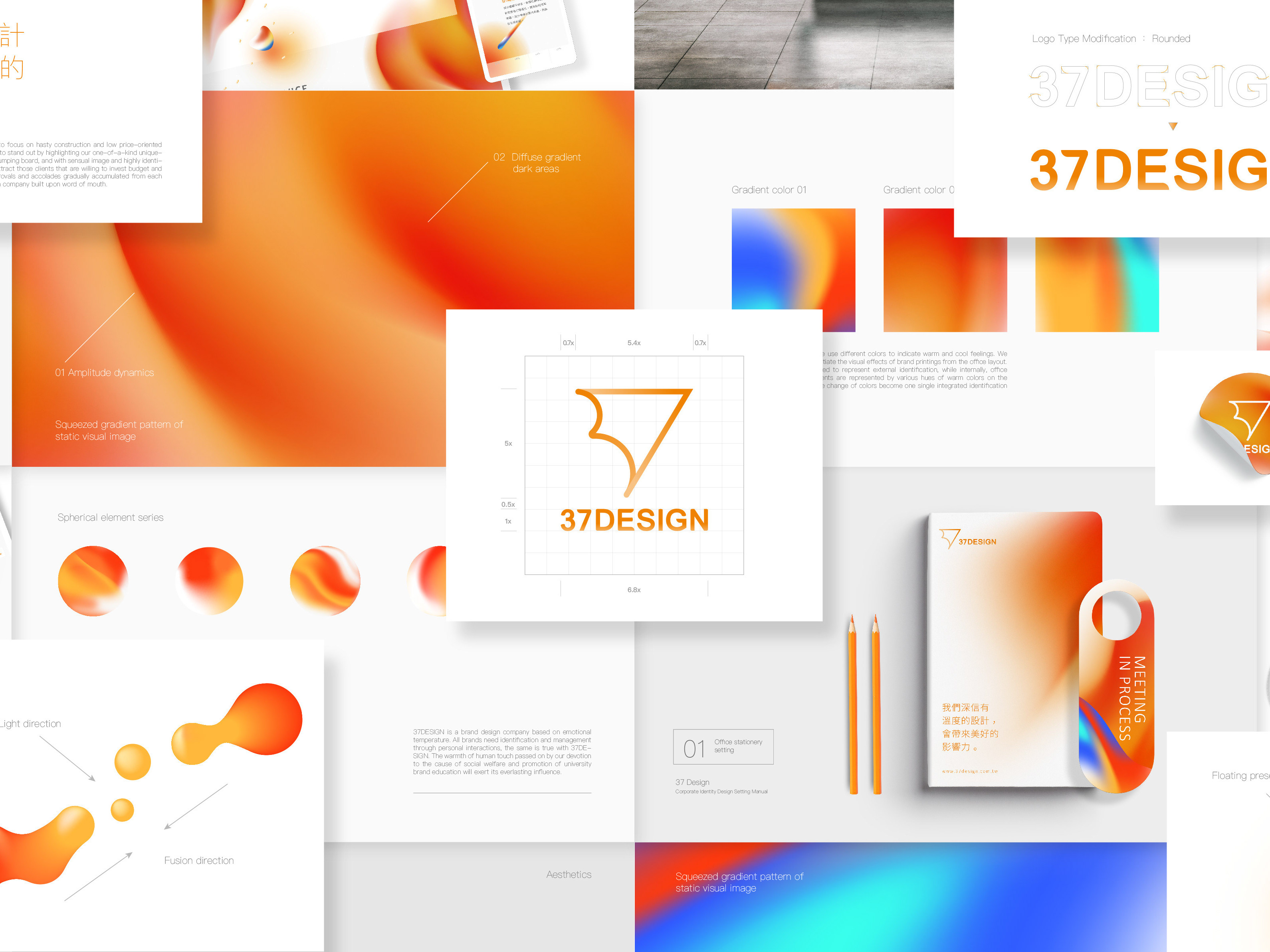
「將品牌的一切安排得恰到好處、適得其所」是適得設計工作室的核心理念。 因此為了呈現「適得其所」的抽象意象,進一步制定了2組關鍵字,「1.平衡:禪意與疊石成塔」、「2.均衡:視覺重量與構圖和諧」,以此為基底,用漸層表達立體感的變化,用均衡的構圖去表達和諧空間的美感,使整體呈現具備禪意與溫潤的質感,創造出特有的識別圖形基因,讓整套企業識別系統在設計應用上具有延伸性。
The core philosophy of Just Right Design Studio is to ensure everything about a brand is arranged perfectly and appropriately. To represent the abstract concept of “just right”,we have established two key concepts: '1. Balance: Zen and stone stacking,' and '2. Stability: Visual weight and harmonious composition.' Based on these principles, we express subtle changes in depth and dimension through gradients and use balanced compositions to highlight the beauty of harmonious spaces. This approach creates a brand identity that exudes a sense of Zen and warmth, forming a distinctive visual DNA for the brand. This ensures that the corporate identity system is highly versatile and recognizable in design applications.
Thanks for your watching!
Brand Design / SHU PEI EN
Consultant / NING YU HSIANG
